Brand identity for a brand new multifamily investment organization
BRIEF
Enzo Brands sought to encapsulate their brand essence into one cohesive identity. From a few brand identity workshops, we worked together to pinpoint the core of the developing Enzo Brands as an innovative and trustworthy brand with a tech-focused aura.
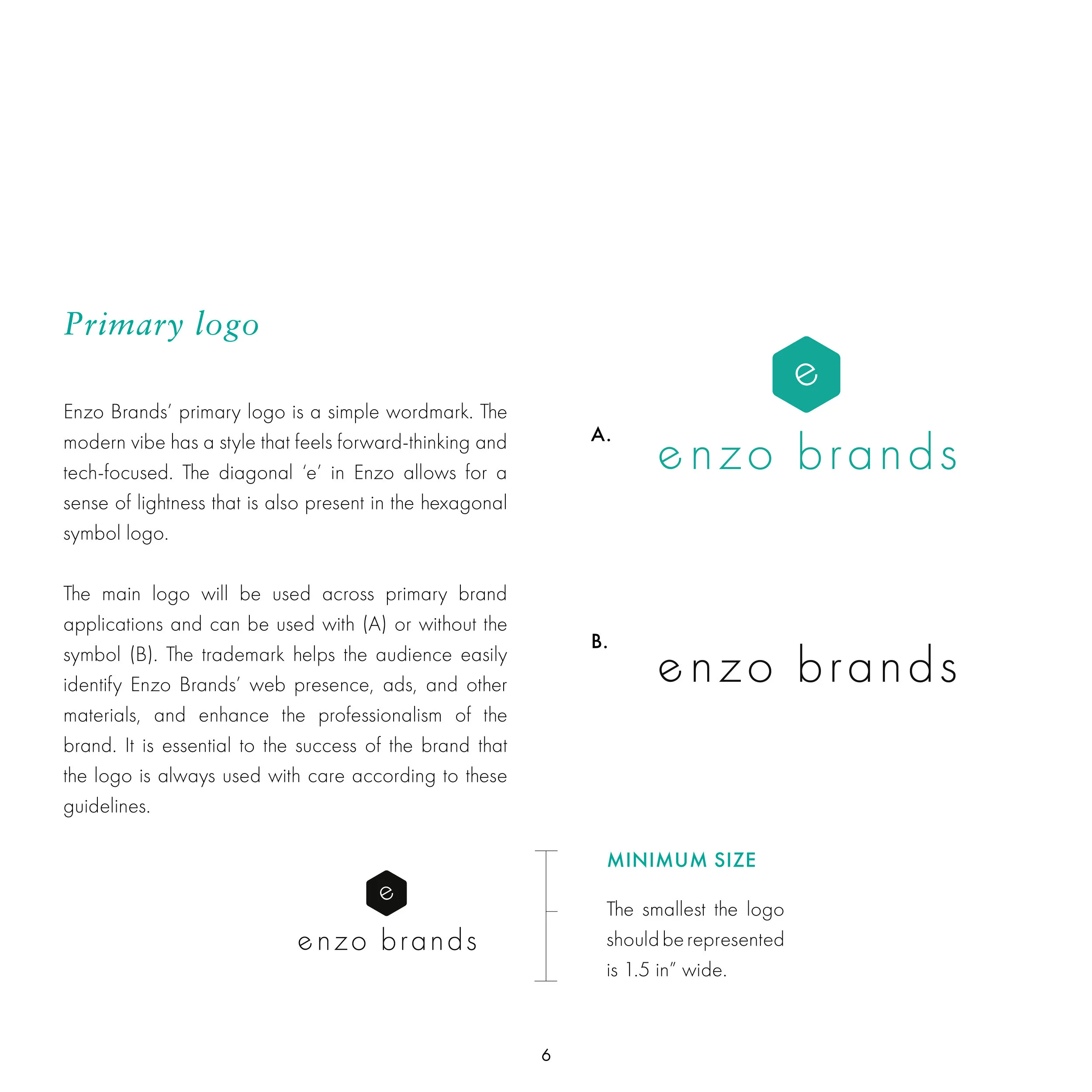
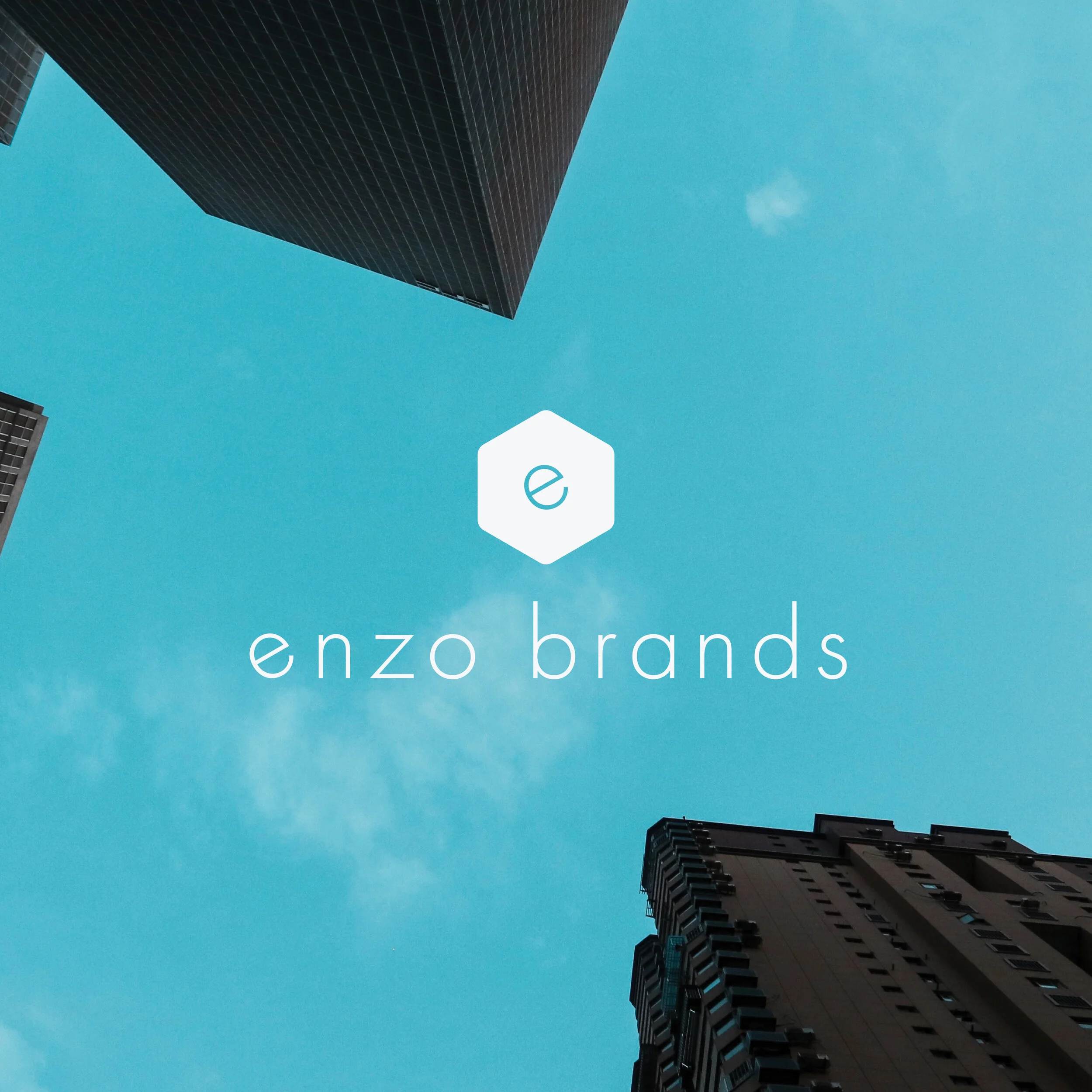
The modern vibe of the logo has a style that feels forward-thinking and tech-focused. The diagonal ‘e’ in Enzo allows for a sense of lightness that is also present in the hexagonal symbol logo. The hexagon is one of the strongest shapes. It feels symmetrical and organic to the eye, similar to the texture of honeycomb in a beehive. Every honey bee in the colony is born knowing how to build this shape. This is the shape of their home, offering a subconscious level of familiarity with the viewer.
The chosen colors are approachable and balanced. Color psychology suggests blue inspires reliability, calm, and confidence. Black offers a level of sophistication, while gray provides a sense of stability - all representative of the ways users should feel with Enzo Brands.
STYLE GUIdE.